
- Role
- Solo (strategy, design, build)
- Timeline
- 2 months
- Stack
- Next.js, Supabase, Stripe
- Status
- Live
Creating a B2B SaaS because nothing else fit.
TL;DR
- I ran a productized design agency and could not find a client management tool that fit how I worked.
- I designed and built Setorio from scratch: a client portal and subscription platform for productized service agencies.
- Six weeks after launch the product has paying customers. A single onboarding change produced a significant lift in completion rate.
The problem I kept running into
I run Mayelow, a design agency for premium hospitality brands, on a subscription model. Clients pay a monthly retainer, submit work, and I deliver. In practice, this meant managing the entire client relationship through email chains. Clients would send a request, then follow up asking if I had seen it. I would reply, and they would ask again for an update. Neither of us had a clear picture of what was happening at any point.
This was not just inefficient. It felt unprofessional for a service I was charging premium rates for. I needed a dedicated tool, so I looked at what existed.
ManyRequests did too much and cost too much. Wayfront was closer in concept but still overpriced, and the interface felt designed for someone else. Agency Handy and Zendo were technically functional but not quite right. Every tool had the same core problem: I could not make it feel like mine. White-labeling was either absent or surface-level. As a designer putting a tool in front of clients every week, that was a hard no. That was the moment I stopped looking and started building.
| Tool | Listed price | How far I got | What stopped me |
|---|---|---|---|
| Orchestra | $59.95/mo | Paid, ran real client work through it | The closest fit. I hit enough bugs that I was explaining them to clients, which is not a position I want to be in. |
| ManyRequests | $59/mo | Free trial | Built around handling request volume. More configuration than a one-person studio needs. |
| Wayfront | $99/mo | Free trial | Same shape: heavy on internal tooling, light on what the client sees. |
| Agency Handy | $99/mo | Reviewed only | Not trialled. Same tool-first approach on paper. |
| Zendo | $59/mo | Reviewed only | Not trialled. Same tool-first approach on paper. |
It wasn’t just me
Before touching a design tool, I needed to know whether this was a personal quirk or a real gap. I went on LinkedIn and reached out to agency owners and solo designers who visibly ran subscription-based services. I kept the message direct: “What do you use for client communication and task management?”
The replies confirmed the gap. People stitched together tools not designed for this use case, overpaid for platforms that did far more than they needed, or defaulted to email. The frustration was consistent: existing options felt too generic, too expensive, or designed without care. That was enough signal to move forward.
My role
I owned everything on this project. On the product side, I defined the MVP scope, decided what to build and what to defer, and set the build sequence. On the design side, I created user flows, information architecture, wireframes, and final UI, along with a component system built on Shadcn adapted to Setorio’s visual identity. On the engineering side, I built the full front-end and back-end using Next.js and Supabase, connected Stripe, and deployed on Vercel.
I used Claude Code to accelerate the build. Every design and architecture decision was mine, but an AI pair programmer let me move from design to working implementation faster. It also kept me honest: I felt the cost of every design choice in real time, not weeks later in a review.
External input came from a small group of UX designers I connected with on LinkedIn. They reviewed early versions, gave flow feedback, and flagged gaps. One wanted per-client service plans instead of global ones. That specific feedback helped me separate my assumptions from shared needs.
Defining what to build
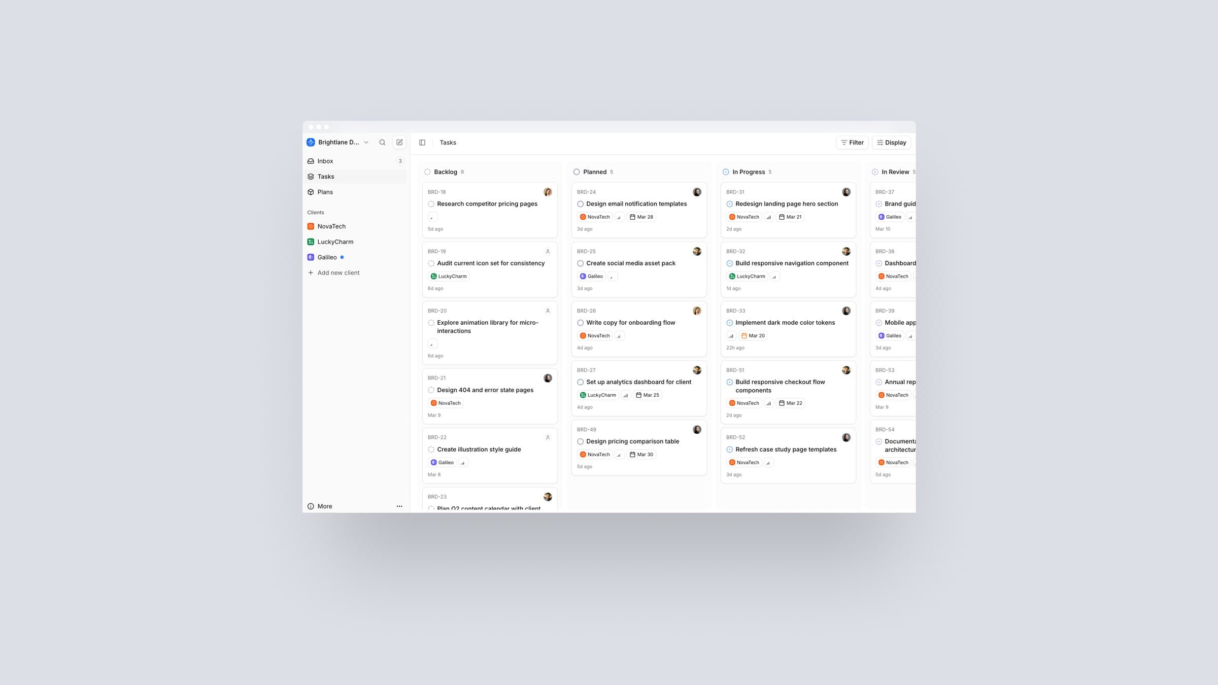
Setorio has one job: give productized agencies a professional, branded space to manage clients and services. An agency creates an account, sets up service plans, connects Stripe, and gets a client portal they can brand and hand to clients. The client sees the plan, submits requests, and tracks progress. The agency manages everything from one dashboard.
Getting there required deciding, clearly, what Setorio would not be.
What I cut, and why
My initial feature list was long: analytics dashboards, approval workflows, custom onboarding flows per client, embeddable signup widgets, Microsoft and Outlook login, emoji pickers. I cut almost all of it.
The filter I applied was simple: does this feature help an agency get their first client into the platform? If not, it waits. Analytics are useful once you have clients to analyze. Embeddable signups help agencies with an established web presence, not first-week users. For authentication, I chose Google only. It covers the majority of the target audience and adding providers adds complexity without expanding access. For payments, I chose Stripe only. It is the market standard and the best-documented integration for this setup.
The discipline here was not minimalism for its own sake. It was about not letting a wanted feature distract from what I was actually trying to prove.
Design process
I started with user flows, not screens. The hardest challenge in a product like Setorio is not individual screens — it is the seams between them. Who creates a plan? When does a client see it? What triggers the Stripe subscription? What does the agency see before inviting their first client? I had to answer these questions in the IA before designing a single screen, because a wrong assumption here cascades through the entire product.
I mapped the core agency journey end-to-end first: account creation, onboarding checklist, plan setup, Stripe connection, client invite, portal access. Only then did I open a design tool.
Once the flows were solid, I moved to wireframes before high-fidelity designs. The goal at this stage was logic, not aesthetics: is the information hierarchy correct? Is it obvious what to do next? Would a non-technical agency owner get through this without help? These wireframes were the filter every screen had to pass before I touched color or type.
For the design system, I chose not to build from scratch. I took Shadcn/UI as the base and adapted it to Setorio’s identity. Building a custom component library from zero, while also acting as the sole engineer, adds weeks and provides little benefit to early users. Shadcn gave me consistency and speed. I redirected the saved time toward decisions that actually differentiated the product. These structural choices set up the build phase that followed.
The hardest design problem
The hardest problem was not a screen. It was figuring out where service plans live in the data model. Is a plan global across the agency and assigned to clients? Or is it created fresh for each client? This is a data model question as much as a UX question. It shapes every related screen. Get it wrong at the architecture level and you are redesigning multiple flows, not just one.
I worked through several iterations before settling on global plans: the agency creates plans once and assigns them at the point of invite. This keeps configuration overhead low and the client experience consistent. Reaching that decision meant reworking both the flow and the underlying data structure at the same time, because I was the one who would build whatever I designed.
Design meets engineering
Designing and building at the same time changed how I made decisions. I could not separate myself from the cost of my choices. When a design created implementation complexity, I felt it immediately — not two weeks later in a developer review.
Using Claude Code sharpened this further. I moved from a design decision to a working implementation fast enough to catch consequences while they were still easy to reverse. I noticed it made me more deliberate, not less. When something gets built in hours rather than days, you think harder before committing.
The tension showed up when a design I was proud of turned out to cost more to build than expected. I learned to notice when I was making a decision for aesthetic reasons versus functional ones, and to be honest about which was driving the choice. When you hold both roles, that conversation cannot be deferred.
The product
The finished product covers four areas: agency onboarding and setup, service plan management with Stripe Connect, the client-facing portal, and the agency dashboard.
The onboarding is where most of the product thinking lives. I designed it as a structured checklist: before you can invite a client, the system guides you through completing your profile, creating at least one plan, and connecting Stripe. An agency with an incomplete setup will confuse their client on day one. The checklist removes that risk before it can happen.
The client portal is the part clients see every week. It carries the most weight for the agency’s professional impression. I kept it focused on three things: plan details, active requests, and status. Nothing that would confuse a non-technical client.
The white-label configuration is what separates Setorio from a generic project management tool. Agencies apply their own branding so the product reflects their identity, not Setorio’s. For a designer charging premium rates, an unbranded third-party tool in front of clients is a contradiction. This feature removes that contradiction.
Validation and what I learned from real users
I tested Setorio in two ways before a wider release. First, I walked every flow as a new user and logged every moment of friction. Second, I ran early versions past the UX designers who had given me feedback during the build. Every issue became a task, created directly in my Notion backlog through Claude. Nothing fell through the cracks.
After launch, one finding surprised me more than anything else.
My original assumption was that removing commitment friction early would drive more engagement. Let users explore freely and subscribe when ready. Almost no one reached the step that makes Setorio useful: inviting a client. Users signed up, looked around, and left.
I changed the flow. I moved plan selection into onboarding itself, surfaced right after the setup questions. Onboarding completion saw a significant lift after the change. Users who chose a plan early were far more likely to send their first client invite within the same week.
The finding was counter-intuitive: asking for commitment earlier did not push users away. It gave them a reason to continue. A product with no stakes has no stakes. These insights shaped how I approach activation design going forward.
Impact & current state
The core flows work end-to-end: onboarding, plan setup, Stripe integration, client invites, portal access. The product does what it is supposed to do.
The onboarding change is the most concrete result from the live product. Moving plan selection earlier produced a significant lift in completion. That result did not come from a design instinct — it came from watching real users, forming a hypothesis about why they were dropping off, and changing the product to test it. The fact that my first instinct was wrong is worth noting. The assumption that reducing commitment friction improves activation is near-universal. Setorio gave me data that challenged it.
The current constraint is traffic, not conversion. When people land on Setorio, the path from visitor to active user is working. Getting more of the right people there is the focus now, through SEO and Google Ads running in the EU and US.
Reflections & learnings
Building Setorio showed me that product is the easier half. The product came together in two months. The design and engineering decisions were hard but solvable. Distribution is a different problem, and I did not invest in it early enough.
If I started over tomorrow, the first month would look completely different. I would collect emails and talk to potential users before designing anything. The LinkedIn conversations I ran gave me confidence in the problem. What they did not give me was an audience for the launch. Shipping to 200 people on a waitlist is a different starting point than shipping to no one.
The onboarding discovery was the most useful product insight from the project. Reducing friction in early flows is treated almost like a rule. My data broke it. Users who committed to a plan early engaged more deeply and completed more of the setup. Reducing friction is not always the right call — sometimes people need something at stake.
Designing and building with Claude Code as a partner was the right approach for this project. It shortened the gap between decision and implementation and produced a product I understood at every level. It also made me more empathetic toward engineers. Some of what I had assumed was implementation resistance was good judgment about cost, and I understand that now.
What’s next
Traffic is the immediate priority. SEO is in progress and Google Ads are running in the EU and US. The goal is consistent visitors at a volume that generates meaningful feedback — because the early conversion signal shows the product holds its own once people are in it.
On the product side, the most-requested feature from early users is per-client service plans. It is a real workflow improvement for agencies managing a varied client mix, and it is the next meaningful thing to build.
Longer term, Setorio is a platform. The client portal and subscription layer is the foundation. The surface area grows as the agencies using it grow. I will build that capability based on what real users ask for, not on what I assume they need.
Other projects
Stuvia
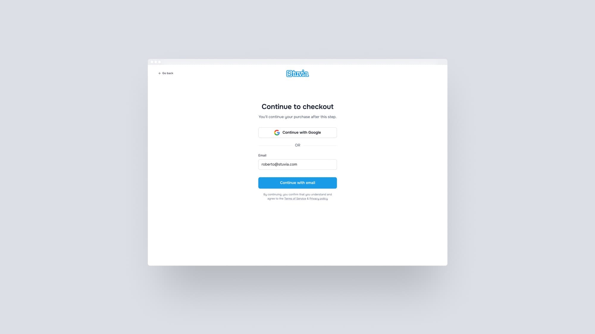
Removing one friction point lifted checkout conversion by 23%
Design system · case study coming soon
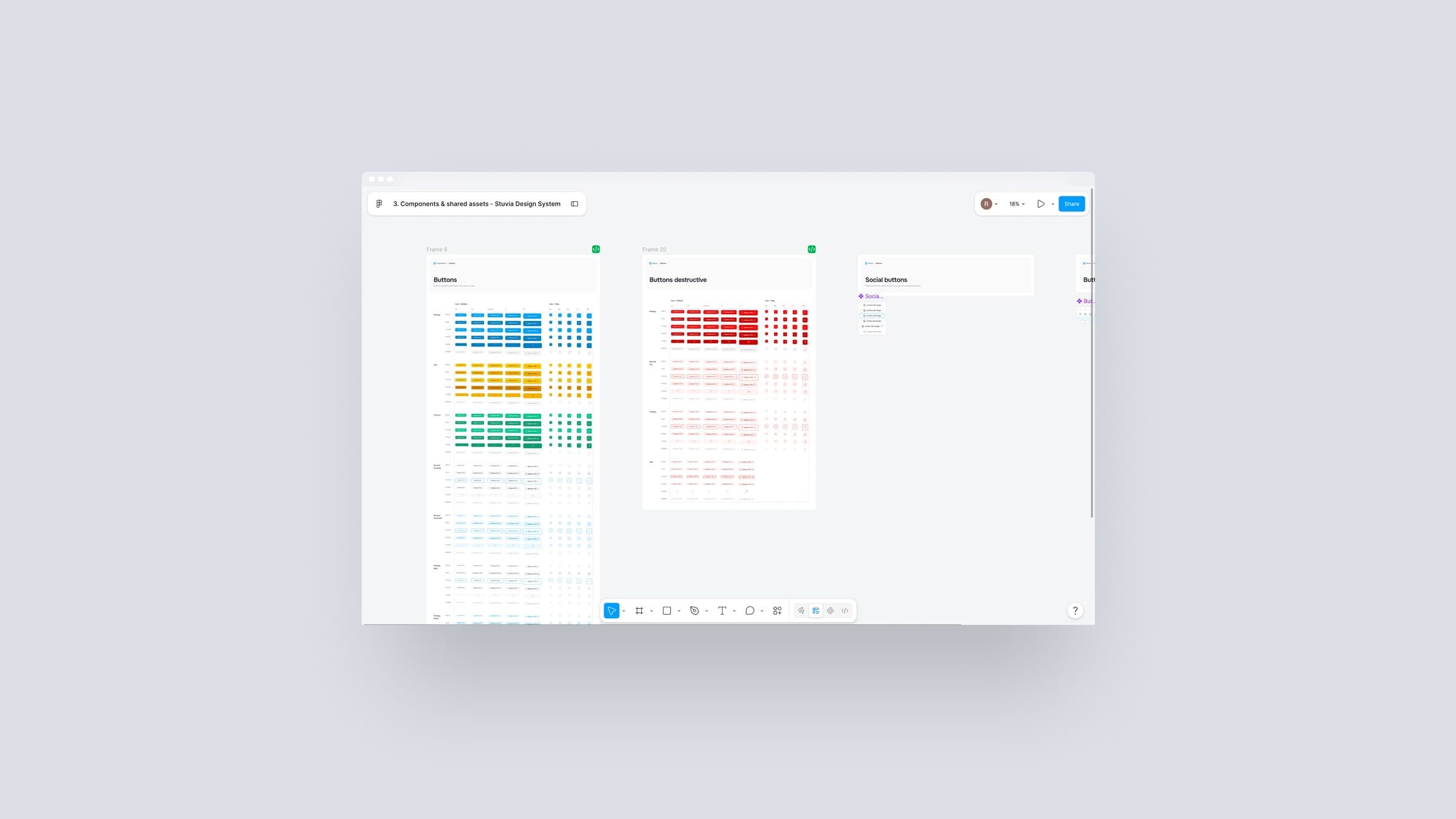
From 15 years of inconsistency to a system the whole team relies on
Facturium · case study coming soon
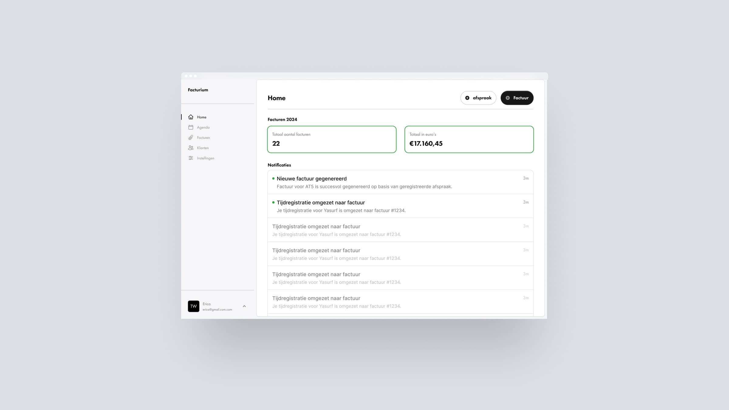
Turning a calendar into an invoicing engine