
- Role
- Product Designer
- Team
- PM, Data Analyst, 4 Developers
- Timeline
- Q4 2025
- Platform
- Web
Removing one friction point lifted Stuvia’s checkout conversion by 23%.
TL;DR
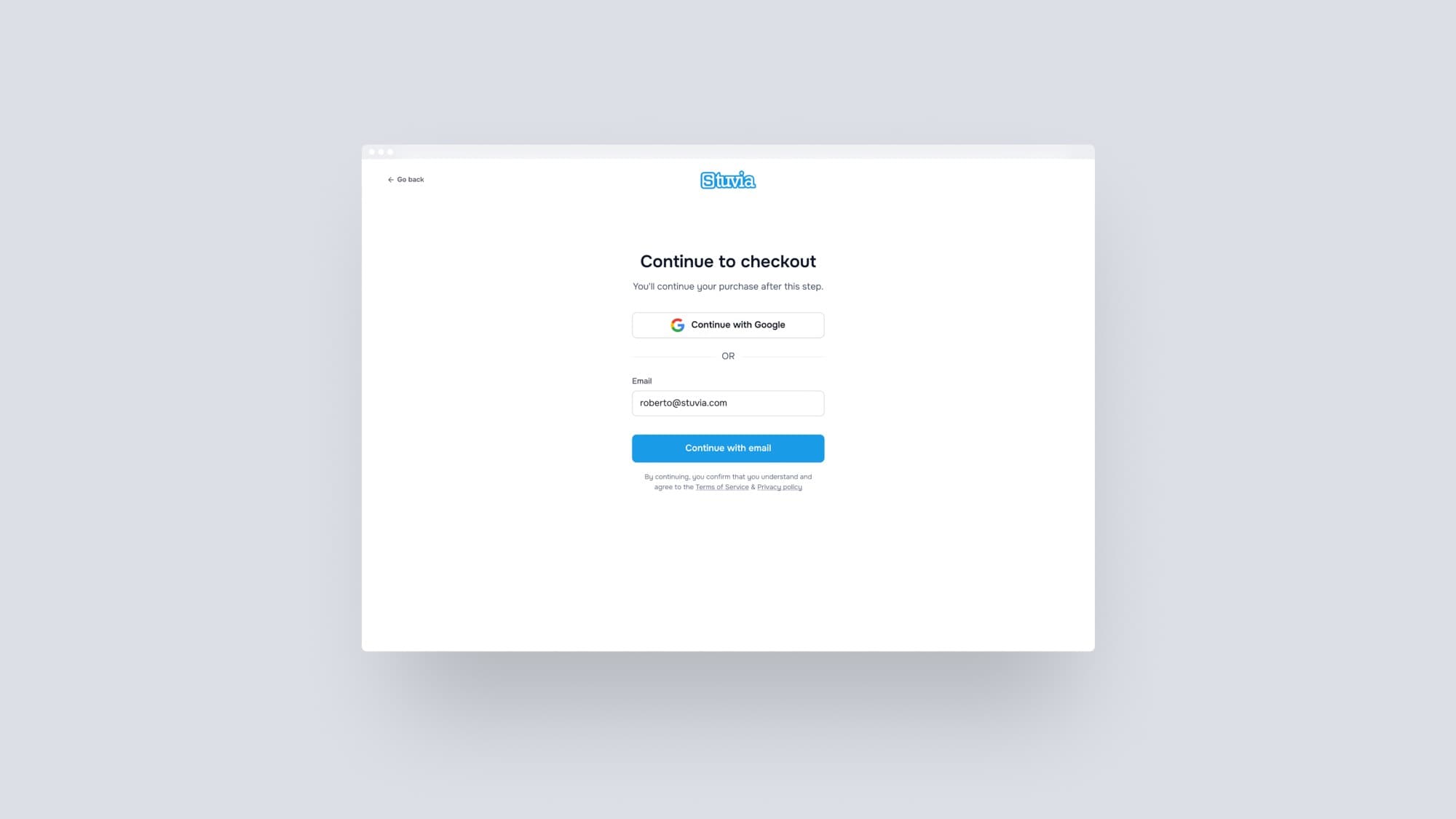
Stuvia’s checkout required a password at the moment of payment. For students who buy once a year, that was enough to make them leave. I redesigned the flow to remove that requirement from checkout entirely. Authentication happens after the purchase, not before it. The result was a 23% relative increase in completed purchases.
The problem
Stuvia sells academic documents to students, most of whom buy once or twice a year. Before they could pay, they had to log in. That requirement existed for a reason: purchases needed to be tied to an account. In practice, it was the main reason users left before completing a transaction.
The funnel data in Amplitude showed a sharp drop at the login step. I pulled up Clarity to see what was happening in those sessions. The pattern was consistent across recordings: password field, failed attempt, exit. Not because of price or intent. Because they could not get past a form field.
The UI made it worse. The checkout had been built by developers, not a designer. The login sat inline on the same page as the payment form and the document summary. A forgot-your-password link existed, but it was the same color and weight as the surrounding text. Most users never noticed it.
What users were struggling with
Three things stood out. First, users were entering the wrong password, repeatedly, with no clear path forward. Second, the recovery option was invisible: same styling, nothing scannable. Third, the login, the payment form, and the document summary all competed for attention on one screen. At the moment a user needed to focus, the interface was doing the opposite.
My role & the team
I was the solo designer on this project. The product manager shaped the brief and held alignment during technical discussions with the team. The data analyst provided the Amplitude data that framed the problem and later confirmed the test results. A team of four developers handled implementation, which turned out to be more involved than the design itself.
Management had flagged checkout as a priority. The diagnosis came from me. I dug into the funnel data and session recordings before the project was formally scoped and identified the password as the root of the problem. At Stuvia, I have space to find problems independently. I bring a proposal to the product manager and we scope the project from there.
Discovery & research
I started in Amplitude to understand where users were leaving. The login step had a sharper drop than anything else in the funnel. I then went into Clarity to look at the behavior behind that number. Every recording told the same story: password field, failed attempt, exit.
From there, one question shaped everything: why are we asking for a password here at all?
Defining the problem
Most Stuvia users are students who buy infrequently. They do not log in regularly. Asking them to recall a password at payment is asking them to do something they almost certainly cannot do. The problem was not a bad login form. It was that the checkout required authentication in a way that contradicted how users actually use the platform.
That reframe pointed toward a different kind of solution.
Exploring solutions
I considered two directions. The first was simpler: give the login its own page instead of embedding it inline. That would eliminate the visual noise and give users a single thing to focus on. The second was more substantial: remove the password requirement from checkout entirely. Authentication would happen passively, through a magic link sent after purchase.
We tested both, in sequence, to isolate what was actually moving the number.
The first A/B test compared the inline login against a full-page experience. That alone produced an 8.22% relative increase in unauthenticated purchase completion, from 37.7% to 40.8%. Focus mattered more than expected. It also set the baseline for the second test.
The second test introduced the no-password flow. The core idea was to let users pay first and authenticate after. A new user enters their email. A background check runs silently. If the email is not in the system, they proceed straight to payment. After a successful purchase, they land on a success screen that doubles as onboarding. That is where they set a password and fill in a few details, after the transaction is already complete.
An existing user follows the same path through checkout. After payment, they receive a confirmation email. The email contains a link to open their document. Clicking it authenticates them silently, connecting the purchase to their account without any extra step.
In both cases, the password prompt is gone from checkout.
Constraints & trade-offs
The Stuvia codebase is over fifteen years old. The developers know it well, but certain patterns run deep. Two questions surfaced early: how do we handle session state after checkout, and how do we keep the magic link secure?
The team resolved the session question with a temporary authenticated state. After completing a purchase, the user can access their document, but it is not a full account session. I had reservations about this. The user is effectively logged in without knowing it. The next time they return to Stuvia, they will need to authenticate from scratch. My preference would have been to surface that in the UI rather than leave it hidden. We accepted the compromise because the alternative would have added significant development complexity and delayed the test.
The other trade-off was about returning users. An existing user who returns outside of a fresh purchase will still need the forgot password flow. We chose to let that friction happen there, not during checkout. A user browsing their library can handle an interruption. A user mid-payment cannot.
Design process
The design moved quickly. I work directly in Figma with Stuvia’s design system, which I built from the ground up, rather than producing wireframes first. The first screens I shared with the team were already at a level where developers could give meaningful feedback. Most of the iteration happened in conversation. The team flagged constraints and I adjusted the flows to work within them.
Getting buy-in from the developers was the harder part. They saw a technically complex project: new versus existing user logic, session handling, magic link security. It was up to me and the product manager to make the case. We used the funnel data to connect the work to a concrete business outcome. Once the team was aligned, we could move.
The solution
The final design has two paths through checkout. Which path a user takes is determined silently in the background, based on whether their email already exists in the system.
A new user enters their email and proceeds to payment without touching a password field. After a successful purchase, they land on a success screen that flows into onboarding. That is where they set a password and fill in a few details, after the transaction is already complete.
An existing user enters their email and goes straight to payment. After checkout, they receive a confirmation email with a link to open their document. Clicking the link authenticates them silently.
In both cases, the password prompt is gone from checkout.
Impact & results
- Purchase completion
- +23.1%
- Earlier full-page login test
- +8.22%
The no-password flow lifted purchase completion from 24.4% to 30.1%. The full-page login change that preceded it had already added an 8.22% relative lift in unauthenticated purchase completion, from 37.7% to 40.8%. Users completing checkout within two minutes went from 17% to 22%.
Both changes were validated through A/B tests that ran over several months.
Reflections & learnings
The design came together fast. The difficulty was in implementation, and some of that difficulty was preventable.
I brought the development team in after the flows were already shaped. That meant early technical constraints surfaced late, and parts of the design had to be revised. An earlier conversation would have caught those issues before they required rework. Going forward, I would involve developers earlier on anything that touches authentication or session logic. Not to let constraints shape the design prematurely, but to surface the less obvious problems while there is still room to factor them in.
The hidden session state is the other thing that stays with me. The user completes a purchase and is technically authenticated, but nothing communicates that to them. The next time they return, they will be asked to log in as if none of it happened. I accepted that trade-off for pragmatic reasons. But a small signal in the UI that tells the user where they stand would be more honest, and would likely reduce confusion when they come back.
Next steps
The first thing I would change is the one I raised during the build. The temporary state should be visible. A user who has just bought something is signed in without being told, and they only find out on their next visit when they are asked to authenticate from scratch. Surfacing that at the moment it is granted costs very little and removes a surprise later.
Beyond that, the checkout redesign raised an obvious follow-up question. What happens when a user comes back six months later and cannot access their account? The magic link gets them through once, but the recovery experience for returning users still reflects the old design. That is the natural continuation of this project: a more forgiving recovery flow that holds the same low-friction standard as the new checkout.
Other projects
Setorio
Creating a B2B SaaS because nothing else fit
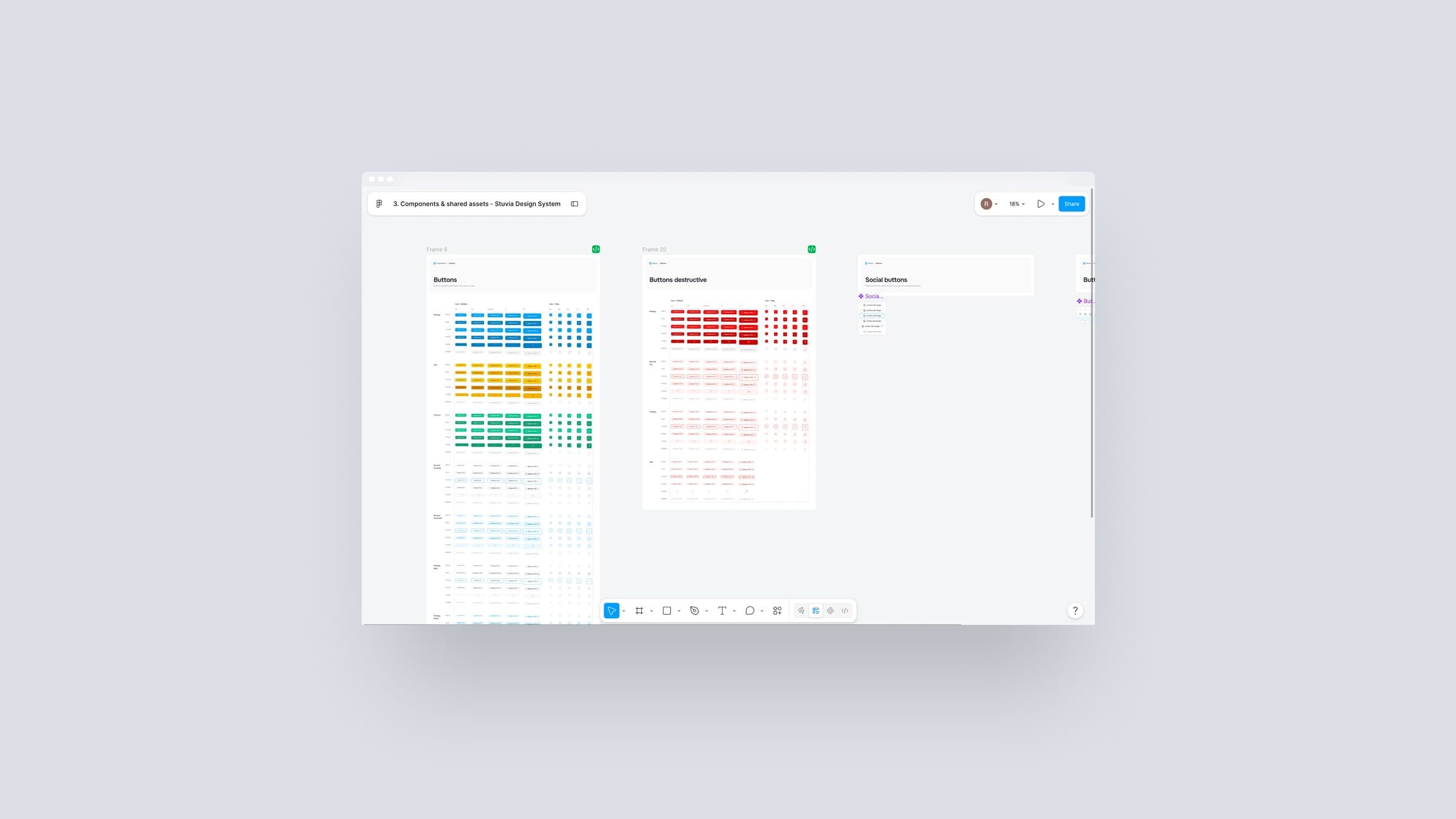
Design system · case study coming soon
From 15 years of inconsistency to a system the whole team relies on
Facturium · case study coming soon
Turning a calendar into an invoicing engine